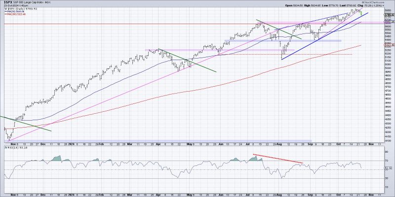
In the process of evaluating potential distribution phases in financial markets, visualization techniques play a crucial role in providing valuable insights to investors. By understanding and interpreting market trends, investors can make informed decisions that can help optimize their investment strategies. Here are three effective ways to visualize the start of a potential distribution phase:
1. **Volume Analysis**:
Volume analysis is a powerful tool that helps investors gauge the strength of market movements. By observing trading volume patterns, investors can identify potential distribution phases where the market is transitioning from accumulation to distribution. A sudden spike in trading volume during a period of relatively stable prices could indicate that large institutional investors are selling off their positions, signaling the start of a distribution phase. Tools such as volume bars and volume-based indicators like on-balance volume (OBV) can help visualize these changes in trading activity and confirm the beginning of a potential distribution phase.
2. **Price and Volume Divergence**:
Price and volume divergence is another essential visualization technique that can signal the onset of a distribution phase. When prices are rising but trading volume is declining, it may indicate a lack of buying interest and a potential distribution of securities by large market players. This divergence between price and volume can be visualized using tools such as volume-weighted average price (VWAP) and volume-based oscillators like the volume-weighted MACD (Moving Average Convergence Divergence). By monitoring these indicators, investors can identify the divergence patterns that precede distribution phases and adjust their investment strategies accordingly.
3. **Chart Patterns**:
Chart patterns are visual representations of historical price movements that can help investors anticipate future market trends. In the context of distribution phases, chart patterns such as head and shoulders, double tops, and descending triangles can provide visual cues of a potential reversal in market direction. These patterns typically indicate a shift from accumulation to distribution as prices fail to move higher and start forming recognizable shapes on price charts. By learning to identify these chart patterns and understanding their implications, investors can visualize the early stages of a distribution phase and take proactive measures to protect their investments.
In conclusion, visualizing the start of a potential distribution phase in financial markets requires a combination of technical analysis tools, volume indicators, and chart patterns. By incorporating these visualization techniques into their analysis, investors can gain valuable insights into market dynamics and make well-informed decisions to navigate distribution phases effectively. As with any investment strategy, it is essential to combine visualization techniques with thorough research and risk management practices to ensure a balanced and informed approach to trading in volatile market conditions.
